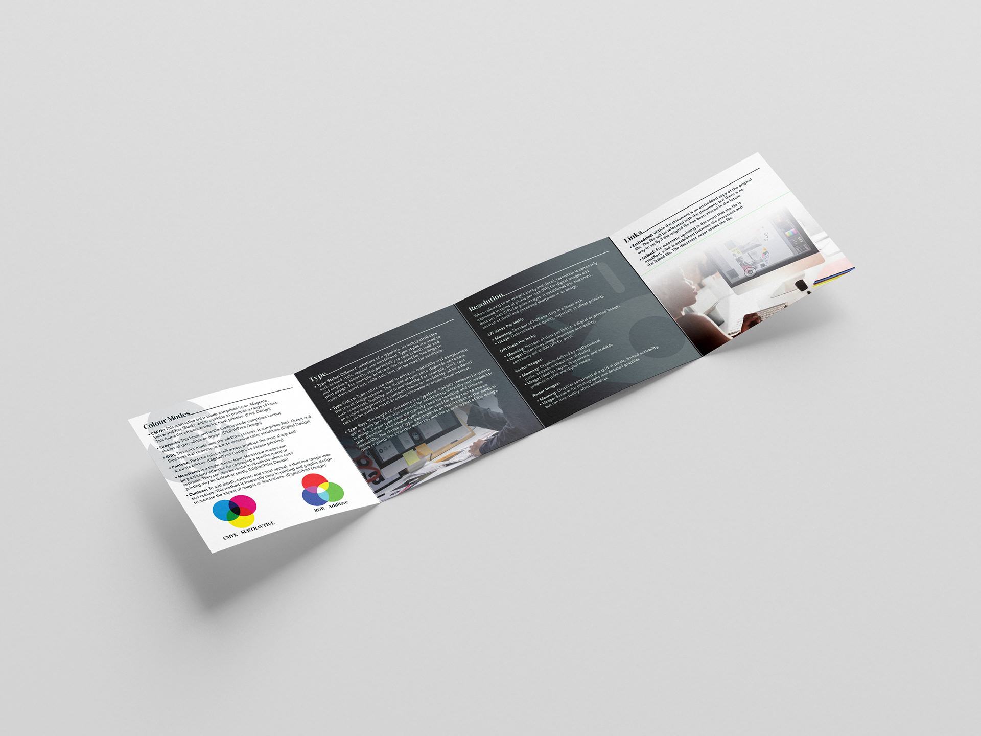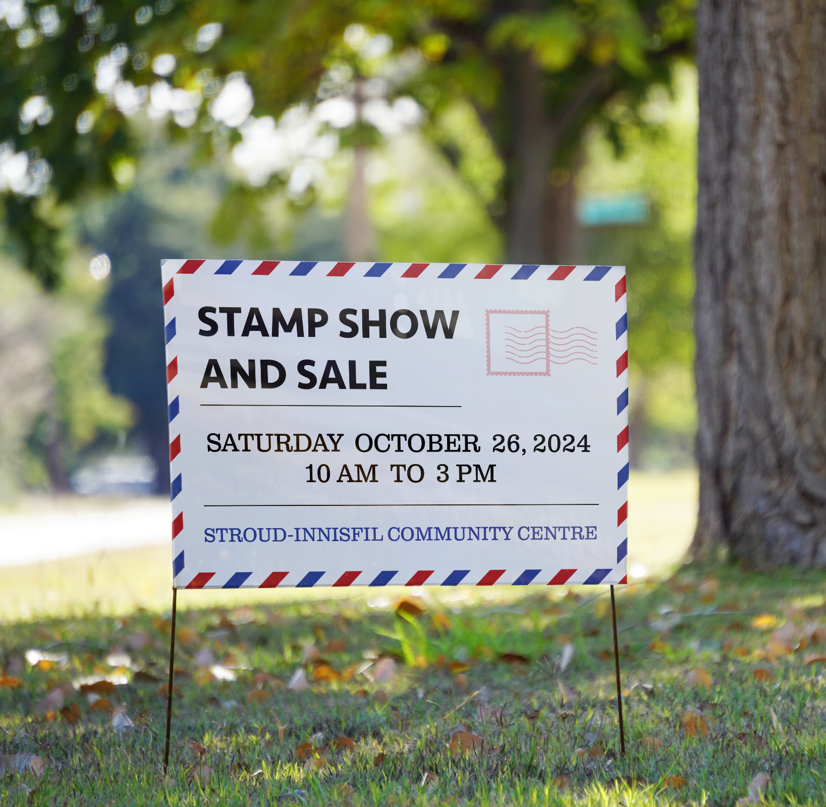
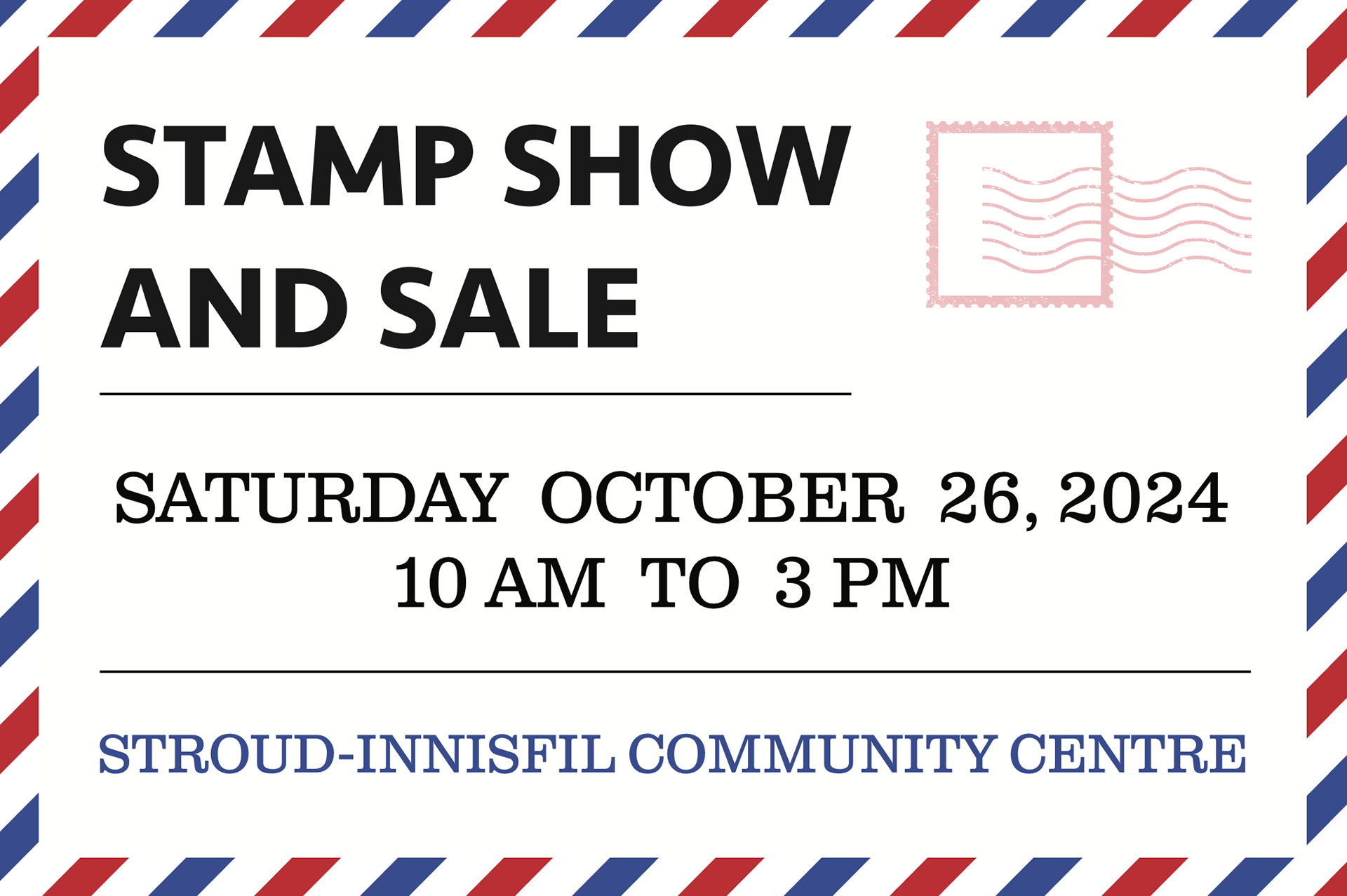

Stamp Show is a rebranding project aimed at revitalizing the visual identity making it more engaging for contemporary audiences. The project includes signage that bring fresh energy to a long-standing celebration of stamps and postal history. The design draws from classic mail aesthetics—perforated edges, vintage fonts, and stamp-like frames—while updating them with modern simplicity and clarity. A balanced colour scheme of navy, crimson, and parchment beige evokes the classic mail experience without feeling dated. Typography is a key element in the design, mixing bold headline fonts with clean sans-serif bodies to create a visual hierarchy that guides viewers through event details. Illustrative icons, such as postage marks, and stamps, are used sparingly to maintain a minimalist yet engaging look.